From Snow to Space

February is a short month, 3/4 are already gone. I managed to draw five paintings in three weeks. Surprisingly, two of them were fanart or kind of fanart. Still, I only will show you four today to keep the fifth for the next time.

The first one is another tale from the Witchphibians series, not only telling a story but also adding to the lore.The second one is fanart of the Netflix series „Trinkets“.

There won’t be any (heavy) spoilers, although in theory the painting as such may be considered a spoiler (despite not really being one).

Another fanart is the Valentins piece I drew of Sam Uggler, the OC of the Instagram artist AlienPrideArt and last but not least, we entered Pisces season. So, enjoy the addition of two fishy OCs to my ZodiOCs series.

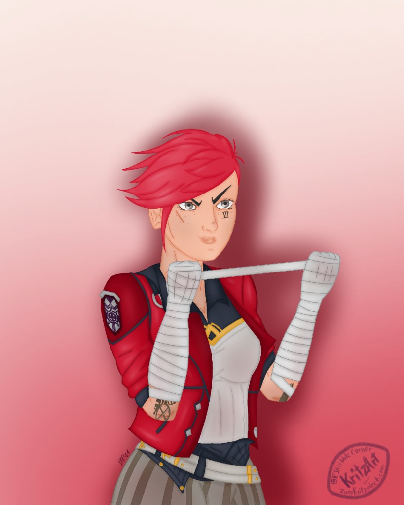
Witchphibians: Warming Thoughts

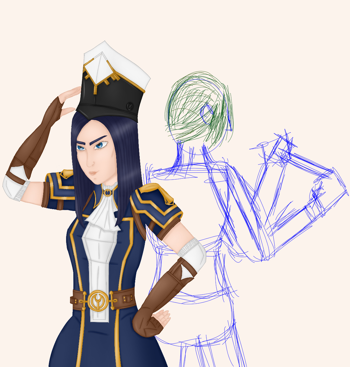
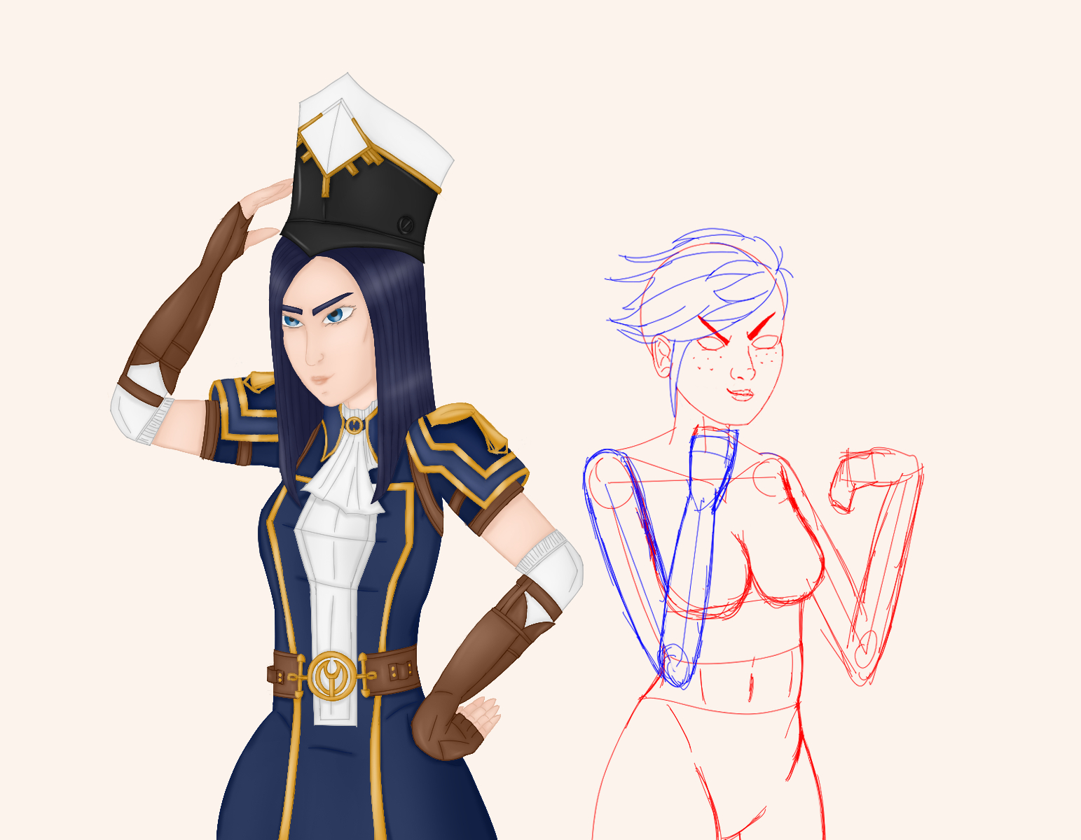
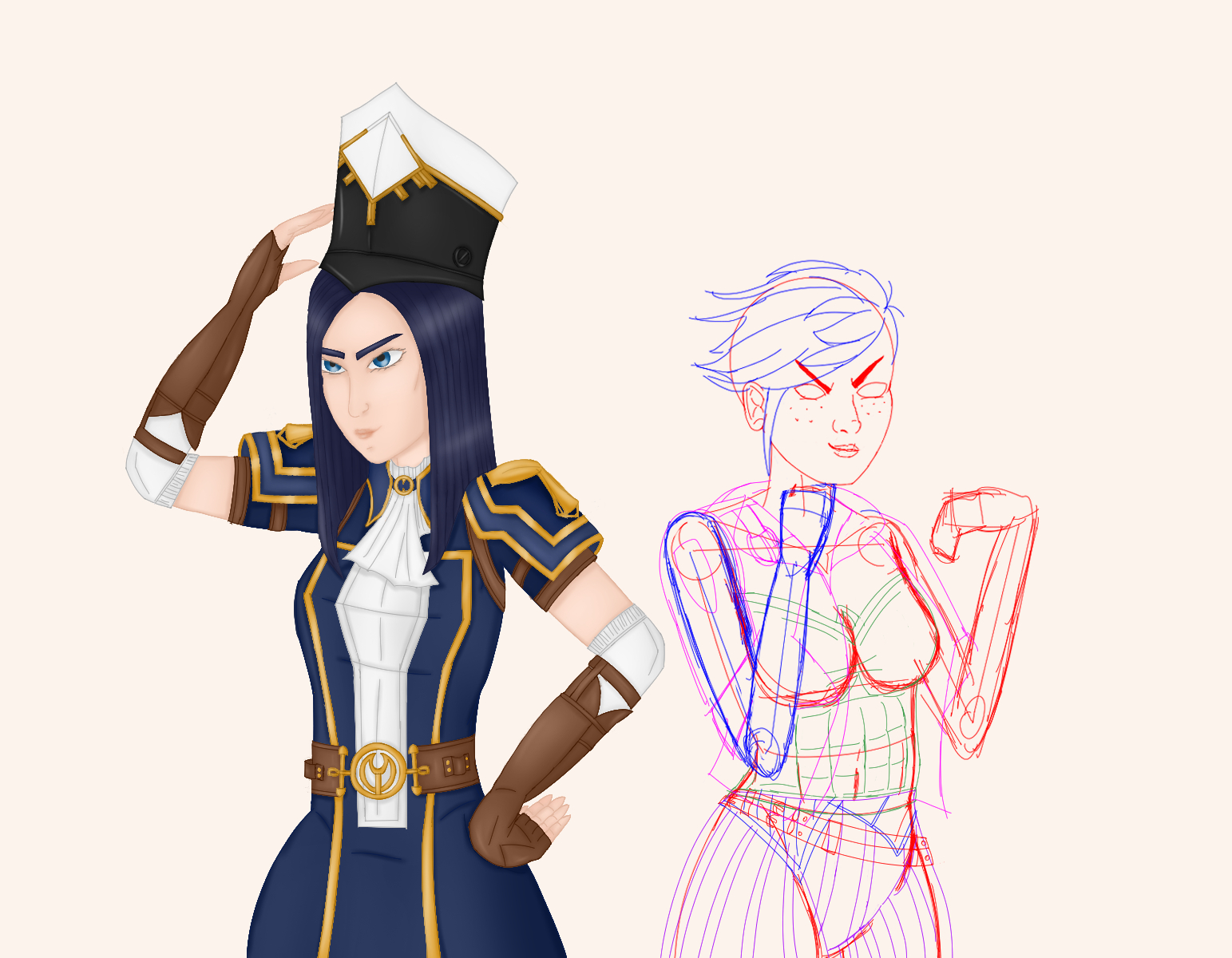
This piece was inspired by an exchange of thoughts on a Discord server about how Raven and Sam would manage winterly tempertures. While feeling cold easily but managing quite well in their human forms, it could get quite freezily when changing into their amphibian forms at the wrong moment.

So, this image popped up in my mind and it was rather convenient since I regretted that I couldn’t show all the character design changes of Raven in the SFW version of the Witchphibian painting before. Now you will be able to spot the freckles on the shoulder region, the arms, the legs, regions that usually would’de have been covered by her dress (on Instagram and Ko-fi at least, for the NSFW version see Patreon).

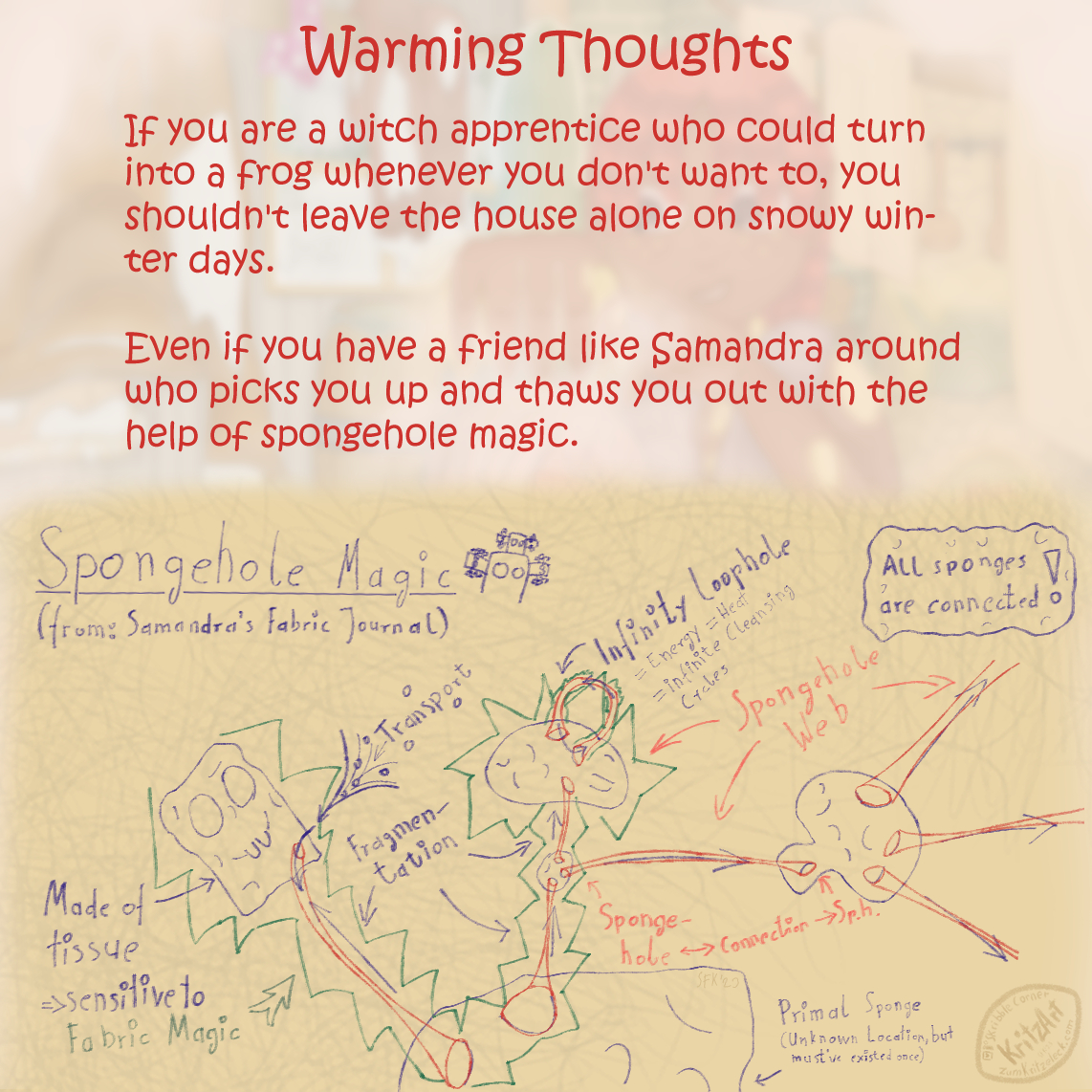
There were a lot of things I practiced this time when drawing it: Perspective, pose, anatomy, water in it’s various forms, but it turned out the actually new thing I tried out was the overall lighting of each section of the painting (left, right, front / main characters) to give each of them a specific feeling.

To this purpose I used overlays and colour gradients. The left side got a blue overlay to give it a cold, wet, muddy feeling, the right one an orange overlay for a warm, dry and clean impression. Finally, I laid a red overlay over the front to make it rosy, cosy, comfortable.

Finally, there is the Spongehole Magic you can read about in slide two. This is an idea I came up with when adding Samandra’s glow to her spots. They glow when she is excited or when she’s doing magic. So, the spongehole magic theory was a handy device to provide her with as much fresh, hot, clean water as she needs to thaw Raven out.

It is inspired by wormholes, of course. When wormholes are holes in space adn time that are connected by tunnels, why shouldn’t the same apply to sponge holes? You would have to have magic abilities to use them, but since sponge tissue technically is nothing different from any other natural fabric materials (animal or plant based), it would be an easy match for Samandra the Fabric Mage to get hold of them.

For everyone who is interested in the drawing process I also created a short video clip made from the drawing steps which I shared earlier with my supporters on Ko-fi.
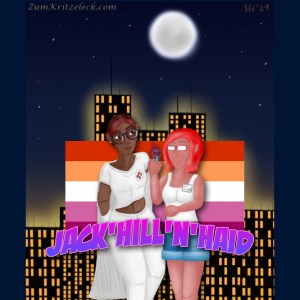
Ride with Sally

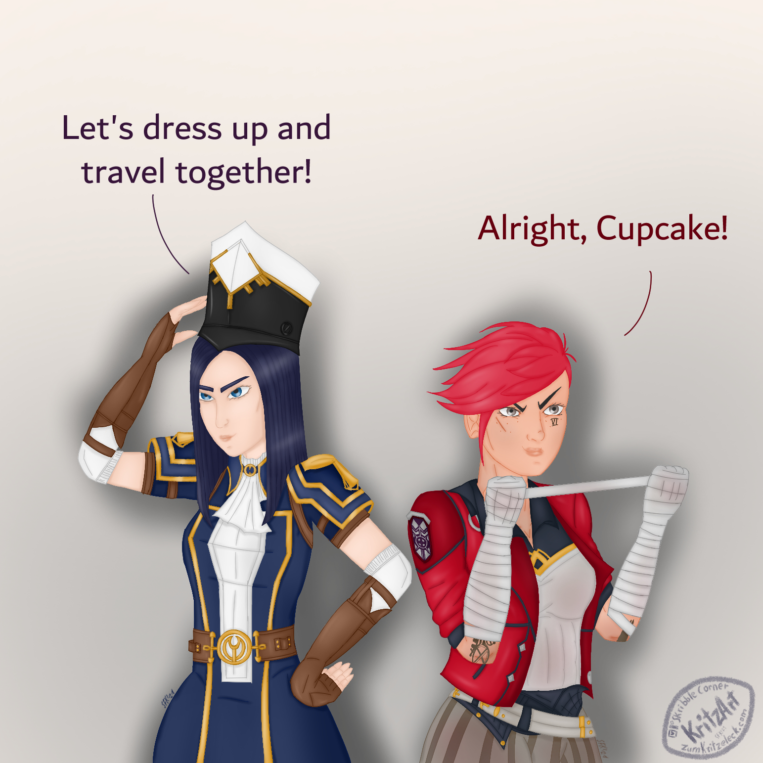
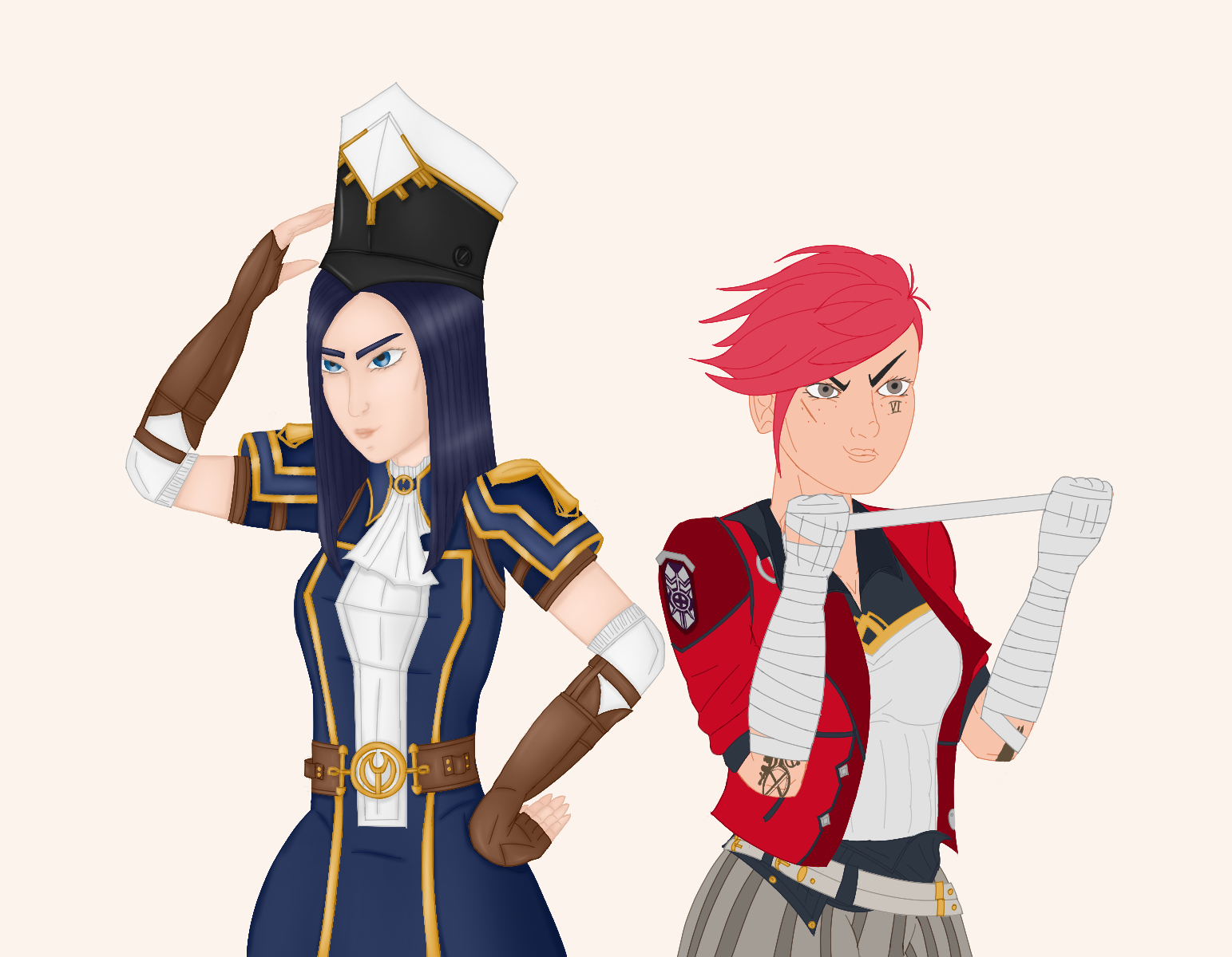
The Netflix show „Trinkets“ is one of my guilty pleasures. I can watch the show again and again and again (and actually, I’m doing this). It’s one of my comfort shows with a great cast, great music, lovely relationships and teenage High School drama with a lot up and downs (most of the time simultanously). It’s already a few years old but Elodie and Jill still make a cute couple.

Is this a spoiler? Not really, not if you already saw the painting. And even regarding the show it’s no real spoiler since the he depicted scene only is inspired, not an actual scene of the show. If you know the show, you surely will recognize the scene, though. If not, see here (Spoiler alert!).

You will notice that I changed Jill’s costume slightly by adding the badge (which also has a special meaning within the show).

It says „I ride with Sally“, hence the title of this piece.
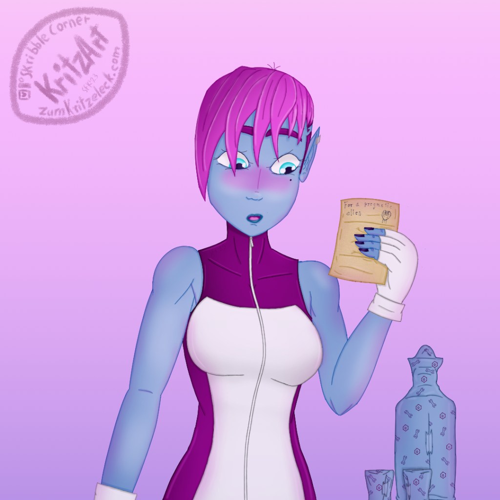
Pragmatic Alien Day

AlienPrideArt‘s drawing and dialogues with his OC Sam Uggler are hilarious. They made me want to draw Sam in my own style and in the forefront of Valentines Day inspiration struck me after seeing this post.

Sam may be a very pragmatic alien, but she asked for Tequilla, so she will get Tequilla and a good old-fashioned Valentines letter.

Happy Pragmatic Alien Day, Sam!

ZodiOC: Pisces

Admittedly, this was an easy one. I remembered Arrivals comic strips that featured two fish last year. Therefore, meet Eusthy and Eusthwo again!

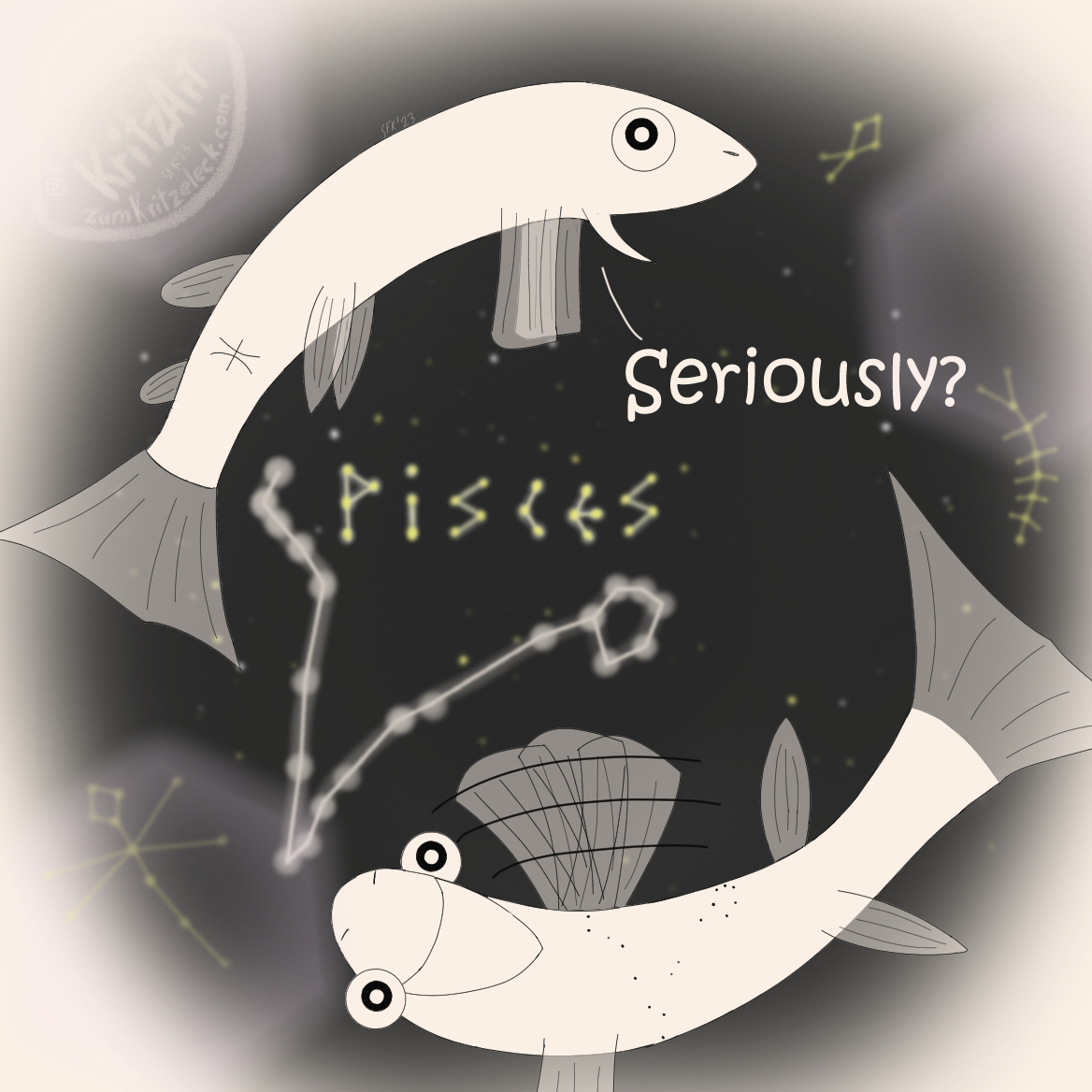
I kept the drawing style of the comics and (of course) the mood of their personalities. In the background you may notice Lilly’s (the dragonfly), Miles (the millipede) and Silvies (the silver fish) accompanying them as constellations in the sky.

Bridging the Pain(t)

Bridging the Pain(t)

Good news and bad news. The good news are, I am on vacation now. So, I’ve got a lot of time just to sit down and to get my art shit done. The bad news are, although I actually was working on some new art the past week, there is nothing finished that I can show you (yet).

On the Arcryla City Discord server, a fifth prompt has been announced that simply goes like:

Finish all the (general) prompts that you didn’t finish yet and they will be shown during the next showcase.

So, you still have to stay patient. However, to fill the gap for tody I thought of giving you some insights into my artist workflow, the steps it takes to create a finished painting. At least the way, I’m doing it.

Bridging the Pain(t)

As hinted in the introduction the following steps are the steps I usually go. Others may do it otherwise and this is okay, I am most comfortable and it worked out best this way for me.

The Painting

I only seldom keep track of my wip process. I just forget too often to save the single steps and when I try to activate the automatical tracker CSP provides, my Pc goes into the knees. So wip videos of mine are very rare.

Luckily, there was one artwork I saved step by step. Therefore it is an excellent shot to go with this one, the Arcane sort of The Owl House fanart crossover painting „Dressing Up“.

Pre-step: Sketching

I rarely do this step, although I do it more often recently than I did it in the past. Most times I start with the lineart (see next stept). I do this step when I’m abroad from Pc (this also including lying in bed and being to lazy to being up again). I thought I did this with this painting too but it seems I only did it on my tablet in CSP. This would make sense since as I started the painting, I just bought the tablet and tried out some things. It also seems like I only sketched Vi – Cait already being finished, but for our purposes it will suffice.

You easily can see how terrible my sketches are and that in the beginning I had another pose for Vi in mind than I actually switched to. Those sketches are only crutches for my thoughts, I look on this messy lines, I don’t even recognize something in them but those lines are leading my thoughts back to the painting I had in mind. And they can lead mit fingers when the actual painting process starts.

1) Lineart

Often I start with drawing the lines. I once read that digital artists like to start drawing them in bright, saturated colors. With Autodesk Sketchbook this wasn’t possible since I never saw a feature to swap the colors once the lines were finished. CSP though has a whole one button function to do this. It actually was one of the reason I switched the graphic software.

And, well, it turned out, it really is very helpful to get the lineart right. I now easily can color separate parts in any separate color I want. Another helpful function are the vector layers. Until the beginning of this year I usually forgot to paint on them but after keeping them in mind, it helps a lot when it comes to resizing parts (or the whole) of the lineart. Whereas normal layers just enlarge the lines and this way also make them thicker, vector layers keep the width and still enlarge what has to be enlarged.

Although I try to draw the lines as straight and tidy as possible, there also may be parts which weren’t that easy to draw, so the lines got blurry and there were flying fragments around. There is a trick to fix this too: Change opacitiy of the blurry lines‘ layer and add a new layer above. Now you can trace the once blurry lines into some new, fresh, tidy ones.

Last but not least, I would like to point out that, once the lines are tidy and finished, I often color all of them with the same saturated color, so I can switch to other parts of the painting and do the same again.

At least, this I did with this artwork. In the meantime I started working simultaneously at the lineart of more than one objects (including parts of the background).

2) Basic Colors

As you could say the lineart is the flesh, the basic colors are the skin.

You often may hear, you should stay with a small color palette and, well, I’d second that. In CSP you can build and save different color palettes to different purposes. Nowadays I mainly stick with one big which colors have turned out to work nicely togeter. But of course I also have a color palette for Arcane fanart that I composed as I drew an earlier fanart piece.

However, the main reason I use a narrowed color palette is that I normally use a separate layer for any different color and body/clothes/whatever part while coloring the respective lines in a darker tone of the underlying basic color. So, I try to keep their numbers low – if only to reduce work (it still could get somewhat out of hands, I have to admit).

3) Rendering

Now there are flesh and skin, they have to come to life. Rendering (adding shading and lighting) makes a big difference to plain basic colors.

Shadows and highligts give depth to a painting. I also use this step to add structures were structures are required to make ouf of a plain brown area a leather armor or a metal surface (depending on the lighting). Or decorate with blood, dust, dirt (you name it). Since I learned how to manage clipping layers, they very well do the trick. They are layers between the lineart layer and the basic color layer to which they are clipped. Or in my case rather folders.

Theoreticall you could do everything on just one clipping layer (and sometimes I do), but I still keep the different shadings (hard vs. soft) and in particular the lighting and the highligts separated to be able to change things later if necessary. The shading again is done with a darker tone of the same basic color, the lighting and highlighting with a lighter one. The greatest part is done by a soft airbrush but I also use a waterly like brush for the highlights too to add some shine.

This step is the one with the greatest change regarding the output but it’s also the most repetitive one since it consists of several smaller steps which are alway the same for every part and every area of the painting. Therefore it’s the most time consuming one and the one I like the least.

4) Post-Production

The above-mentioned steps are done for every figure and object in the painting, the painting has living flesh and skin. Now I’m going to style it a little bit.

I call this step the post-production since I usually now would add some more effects like a blur effect, motion blur, glitter and flares, reflections, mist, diffuse backgrounds or whatever comes to my mind to give the painting a last makeover. Adding my signature and my logo also is part of this step (if I don’t want to share the wip sooner along the way) as well the text said in a comic like this one.

For this painting, indeed the post-production consistes of the background, the background shadows and the text:

Editing the background and resizing the canvas to get both as paintings of their own likeweise counts under this step (although I did this with Cait as soon as she was finished and so I did with Vi).

To boldly to draw …

🇩🇪 Heute kann ich euch an dieser Stelle leider nicht viel Neues bieten. Grund ist diesmal jedoch, so paradox das zuerst einmal erscheinen mag, dass ich mir kürzlich ein neues Grafikprogramm, Clip Studio Paint (CSP), zugelegt habe, das es bis vor Kurzem im Sale gab. Dieses habe ich erst einmal meinen persönlichen Bedürfnissen anpassen und mich damit vertraut machen müssen.

Inzwischen habe ich alle von Sketchbook gewohnten und lieb gewonnenen Funktionen gefunden und darüber hinaus so einige mehr, die ich gar nicht mehr missen möchte. Man kann fast jede Funktion mit einem Shortcut belegen, ganz besonders genieße ich ja die Möglichkeit, die Pinselgröße mit einem einzigen Tastendruck zu ändern und das ich nun (ebenfalls durch einen einzigen Tastendruck) die Farbe auf einer Ebene vollständig durch eine andere ersetzen kann. Das war schrecklich in Autodesk: Wenn ich mit einer Farbe nicht zufrieden war, musste ich komplett neu drüberpinseln/füllen. Ebenso soll es ein Gitternetz für das perspektivische Zeichnen geben, das ich allerdings erst noch ausprobieren muss.

Von beiden Funktionen habe ich früher bereits in Zeichentutorials gelesen und war immer sehr neidisch, dass das möglich sein soll. Schon alleine deshalb bereue ich den Kauf nicht. Es gibt noch weitere Funktionen, die CSP drauf hat und die sehr praktisch sind oder sehr vielversprechend und derzeit sitze ich bereits an einer Zeichnung, die ich allerdings erst nächste Woche zeigen kann.

Dafür kann ich euch aber meinen ersten Gehversuch mit CSP zeigen, eine Skizze die während meiner ersten Versuche des Austestens entstand. Auch diese werde ich in Zukunft noch weiter mit Leben (und Farbe) füllen:

🇬🇧 Today, there isn’t much news. Reason being this time, as paradoxal this may sound, that I recently got a no grafi app, Clip Studio Paint (CSP), which was on sale. I had to costumize and to get used to it during the last week.

Now I found all the beloved features which I knew from Sketchbook and a lot more which I never want to miss again. Almost every feature can be given a shortcut, in particular I’m enjoying resizing the brush size by simple pressing one key and that I can exchange (likewise with just one shortcut) the color of one layer for another one. In Sketchbook it was terrible: When I wasn’t satisfied with one colour I had to paint over it again. I also saw the option to use a perspective grid which I still have to try out, though.

I saw both options in drawing tutorials already and was quite jelous that with other programmes this is possible. So, I don’t regret to have bought CSP. There are other features, too, which are very handy or promising and at the moment I am already drawing my next painting. However, I can only show it to you next week.

Instead, you can see my very first try with CSP, a sketch I did while trying out the software the firt time. I will fill it further with life (and colour) in the future:

Daneben habe ich in der letzten Woche im Rahmen des Pride Month meine OCs für den (für die ferne Zukunft geplanten) Comic „Jack’Hill’n’Haid“ noch einmal auf Instagram vorgestellt und die beiden Hauptfiguren mit Texttafeln versehen:

Beside this I again presented my OCs of the (planned for the far future) „Jack’Hill’n’Haid“ Comic as contribution to the Pride Month on Instagram and added description sheets to both main characters.