Good news and bad news. The good news are, I am on vacation now. So, I’ve got a lot of time just to sit down and to get my art shit done. The bad news are, although I actually was working on some new art the past week, there is nothing finished that I can show you (yet).
On the Arcryla City Discord server, a fifth prompt has been announced that simply goes like:
Finish all the (general) prompts that you didn’t finish yet and they will be shown during the next showcase.
So, you still have to stay patient. However, to fill the gap for tody I thought of giving you some insights into my artist workflow, the steps it takes to create a finished painting. At least the way, I’m doing it.
Bridging the Pain(t)
As hinted in the introduction the following steps are the steps I usually go. Others may do it otherwise and this is okay, I am most comfortable and it worked out best this way for me.
The Painting
I only seldom keep track of my wip process. I just forget too often to save the single steps and when I try to activate the automatical tracker CSP provides, my Pc goes into the knees. So wip videos of mine are very rare.
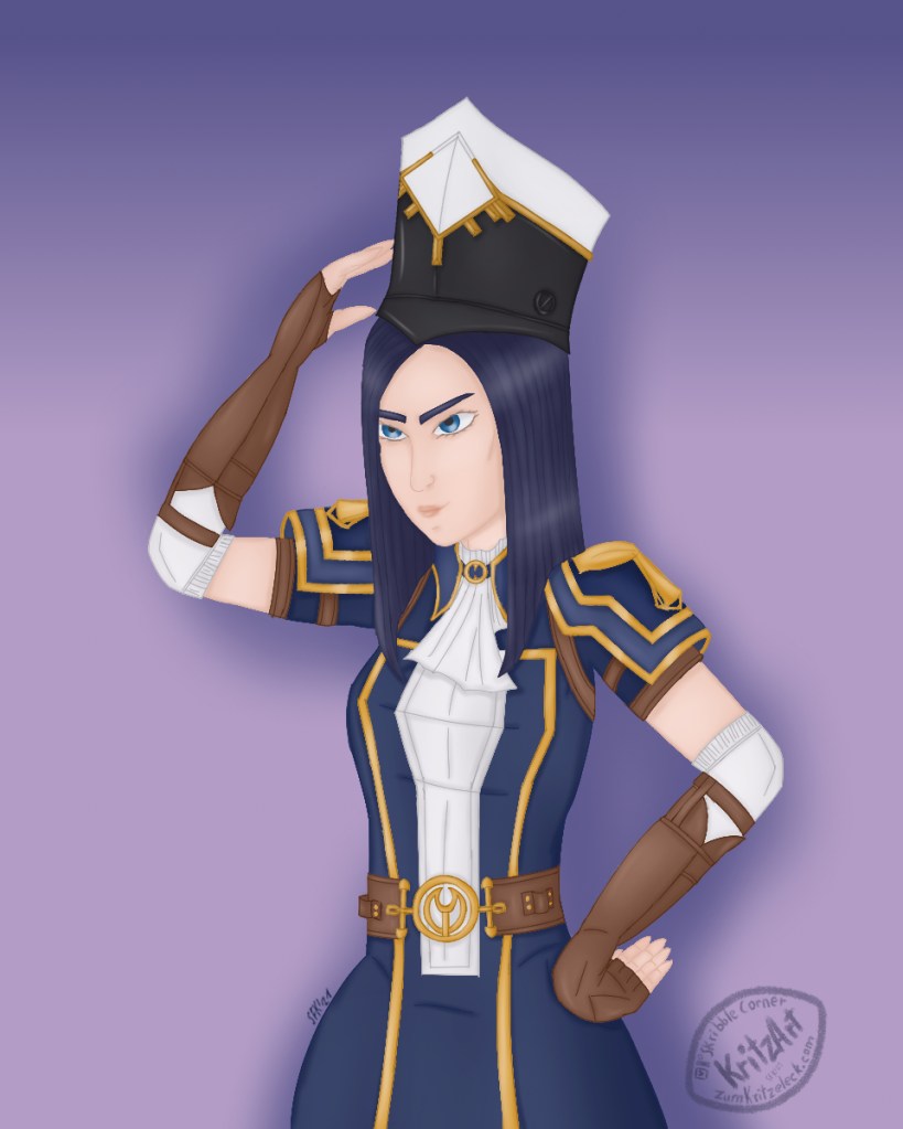
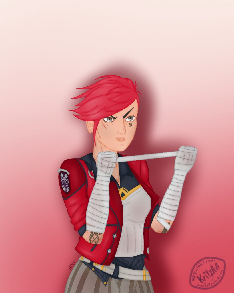
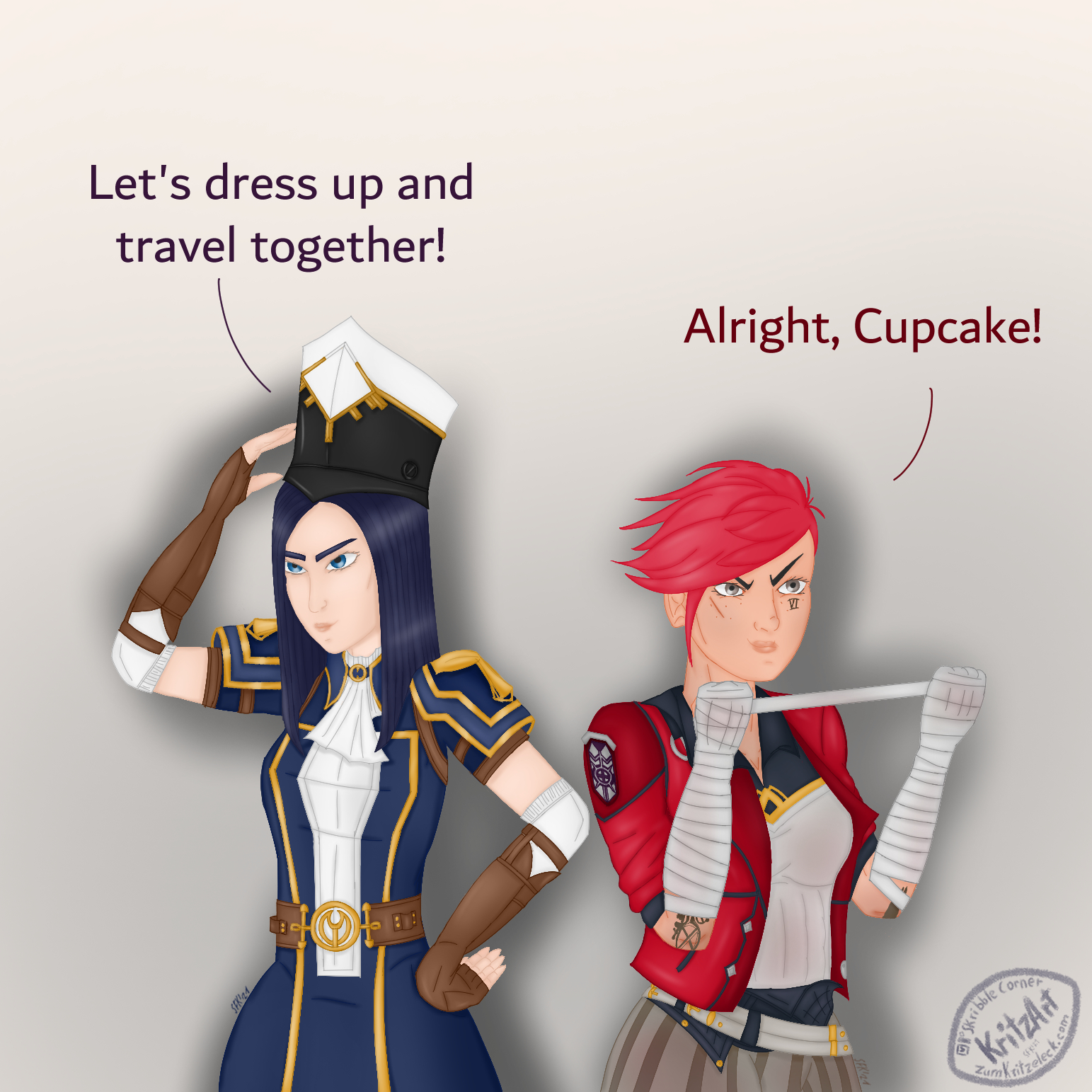
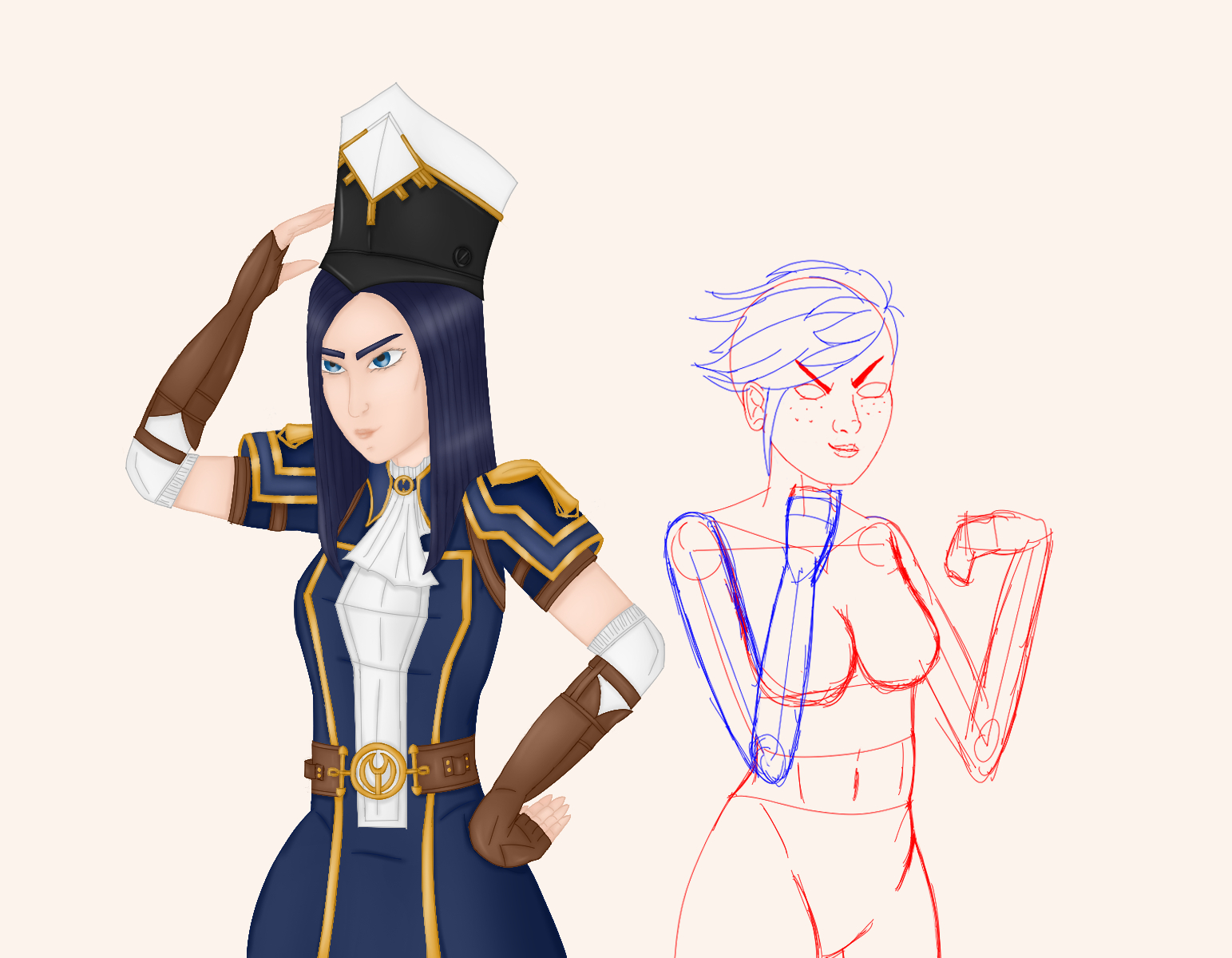
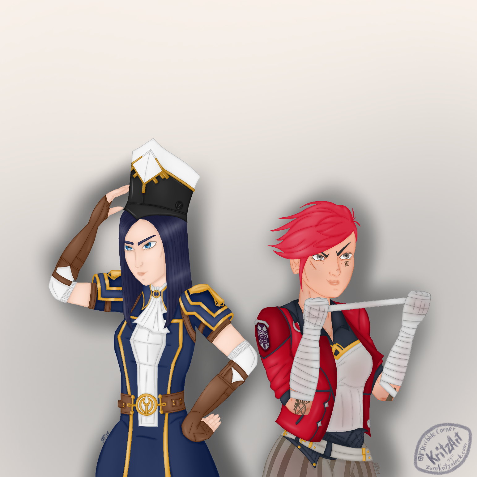
Luckily, there was one artwork I saved step by step. Therefore it is an excellent shot to go with this one, the Arcane sort of The Owl House fanart crossover painting „Dressing Up“.
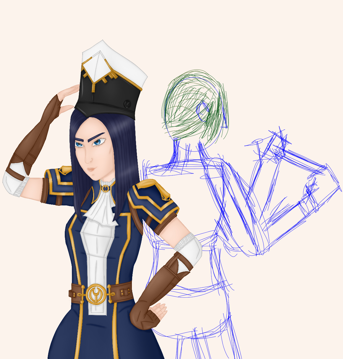
Pre-step: Sketching
I rarely do this step, although I do it more often recently than I did it in the past. Most times I start with the lineart (see next stept). I do this step when I’m abroad from Pc (this also including lying in bed and being to lazy to being up again). I thought I did this with this painting too but it seems I only did it on my tablet in CSP. This would make sense since as I started the painting, I just bought the tablet and tried out some things. It also seems like I only sketched Vi – Cait already being finished, but for our purposes it will suffice.
You easily can see how terrible my sketches are and that in the beginning I had another pose for Vi in mind than I actually switched to. Those sketches are only crutches for my thoughts, I look on this messy lines, I don’t even recognize something in them but those lines are leading my thoughts back to the painting I had in mind. And they can lead mit fingers when the actual painting process starts.
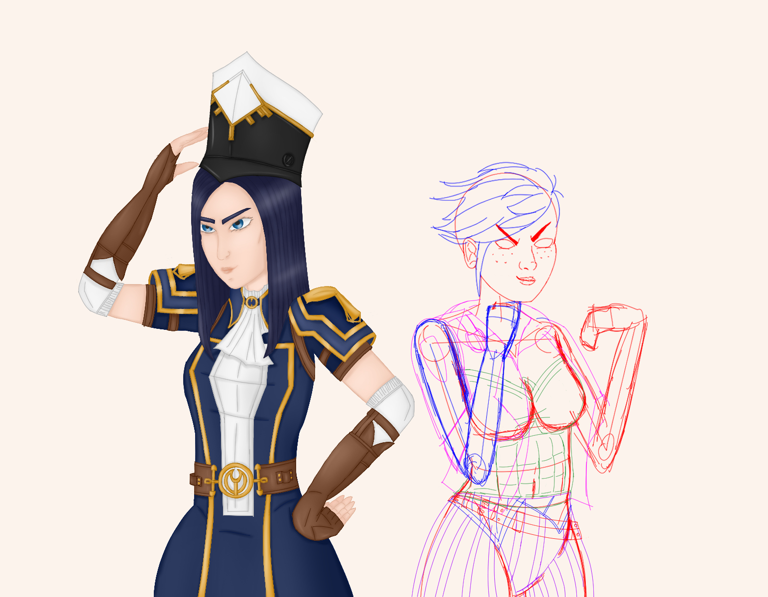
1) Lineart
Often I start with drawing the lines. I once read that digital artists like to start drawing them in bright, saturated colors. With Autodesk Sketchbook this wasn’t possible since I never saw a feature to swap the colors once the lines were finished. CSP though has a whole one button function to do this. It actually was one of the reason I switched the graphic software.
And, well, it turned out, it really is very helpful to get the lineart right. I now easily can color separate parts in any separate color I want. Another helpful function are the vector layers. Until the beginning of this year I usually forgot to paint on them but after keeping them in mind, it helps a lot when it comes to resizing parts (or the whole) of the lineart. Whereas normal layers just enlarge the lines and this way also make them thicker, vector layers keep the width and still enlarge what has to be enlarged.
Although I try to draw the lines as straight and tidy as possible, there also may be parts which weren’t that easy to draw, so the lines got blurry and there were flying fragments around. There is a trick to fix this too: Change opacitiy of the blurry lines‘ layer and add a new layer above. Now you can trace the once blurry lines into some new, fresh, tidy ones.
Last but not least, I would like to point out that, once the lines are tidy and finished, I often color all of them with the same saturated color, so I can switch to other parts of the painting and do the same again.
At least, this I did with this artwork. In the meantime I started working simultaneously at the lineart of more than one objects (including parts of the background).
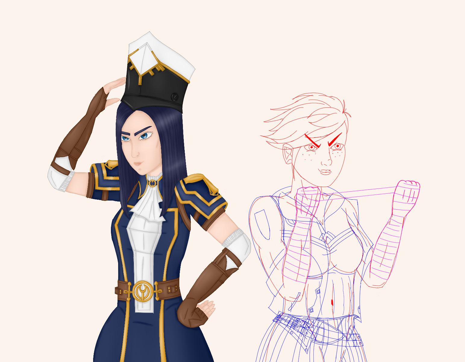
2) Basic Colors
As you could say the lineart is the flesh, the basic colors are the skin.
You often may hear, you should stay with a small color palette and, well, I’d second that. In CSP you can build and save different color palettes to different purposes. Nowadays I mainly stick with one big which colors have turned out to work nicely togeter. But of course I also have a color palette for Arcane fanart that I composed as I drew an earlier fanart piece.
However, the main reason I use a narrowed color palette is that I normally use a separate layer for any different color and body/clothes/whatever part while coloring the respective lines in a darker tone of the underlying basic color. So, I try to keep their numbers low – if only to reduce work (it still could get somewhat out of hands, I have to admit).
3) Rendering
Now there are flesh and skin, they have to come to life. Rendering (adding shading and lighting) makes a big difference to plain basic colors.
Shadows and highligts give depth to a painting. I also use this step to add structures were structures are required to make ouf of a plain brown area a leather armor or a metal surface (depending on the lighting). Or decorate with blood, dust, dirt (you name it). Since I learned how to manage clipping layers, they very well do the trick. They are layers between the lineart layer and the basic color layer to which they are clipped. Or in my case rather folders.
Theoreticall you could do everything on just one clipping layer (and sometimes I do), but I still keep the different shadings (hard vs. soft) and in particular the lighting and the highligts separated to be able to change things later if necessary. The shading again is done with a darker tone of the same basic color, the lighting and highlighting with a lighter one. The greatest part is done by a soft airbrush but I also use a waterly like brush for the highlights too to add some shine.
This step is the one with the greatest change regarding the output but it’s also the most repetitive one since it consists of several smaller steps which are alway the same for every part and every area of the painting. Therefore it’s the most time consuming one and the one I like the least.

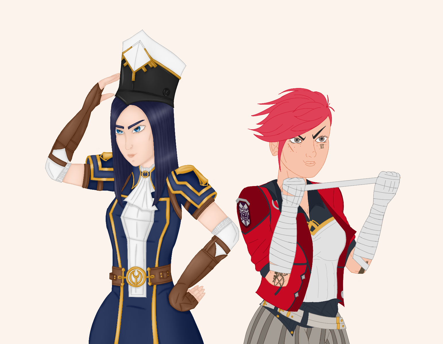
4) Post-Production
The above-mentioned steps are done for every figure and object in the painting, the painting has living flesh and skin. Now I’m going to style it a little bit.
I call this step the post-production since I usually now would add some more effects like a blur effect, motion blur, glitter and flares, reflections, mist, diffuse backgrounds or whatever comes to my mind to give the painting a last makeover. Adding my signature and my logo also is part of this step (if I don’t want to share the wip sooner along the way) as well the text said in a comic like this one.
For this painting, indeed the post-production consistes of the background, the background shadows and the text:

Editing the background and resizing the canvas to get both as paintings of their own likeweise counts under this step (although I did this with Cait as soon as she was finished and so I did with Vi).